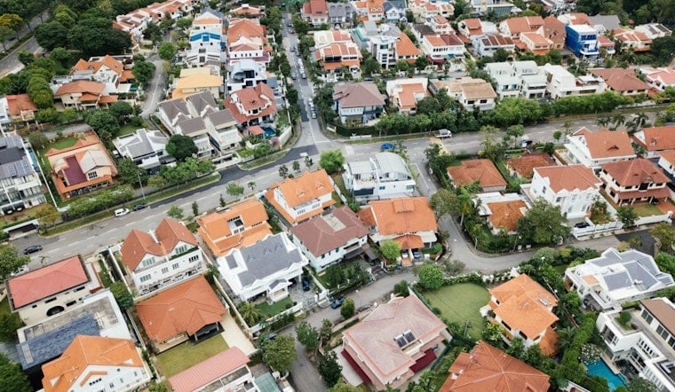
A new interactive map of Atlanta home values is putting the city’s housing divide in stark color. The visualization tracks single-family home price gains and losses across more than 200 intown neighborhoods, turning years of data into an uncomfortable reality check: some blocks are sprinting ahead, others are slipping behind.
How the map was made
The tool compiles three- and five-year trends using Zillow metrics, according to Urbanize Atlanta. Urbanize reports that the visualization was assembled by David Holcombe and built with Anthropic’s AI Claude. Zillow’s research guide notes that the Zillow Home Value Index estimates a typical home value for a region, while the Zillow Home Value Forecast projects where that index may head based on model-driven expectations.
What the map shows
Holcombe’s breakdown, covering 207 City of Atlanta neighborhoods, casts the city’s trajectory as distinctly “K-shaped,” with higher-priced areas continuing to post gains while more affordable neighborhoods stall or drop. According to his summary, top-performing neighborhoods have averaged roughly 5–6% annual appreciation over the past three years, while some of the least expensive areas have lost as much as 7% in that same window. The analysis also points out that Old Fourth Ward is down more than 2% in recent years, a sharp turn for a neighborhood long associated with BeltLine-fueled growth, as detailed by Holcombe Real Estate.
Neighborhood winners and losers
On the map’s brighter side, Collier Hills, Virginia-Highland and Chastain Park show up as steady climbers, their home values continuing to march upward. On the other end, wide stretches of southwest Atlanta and several intown pockets register as some of the steepest declines. Midtown, meanwhile, looks almost flat on the three-year view, reflecting a more complicated mix of demand and supply in the city’s core. Urbanize Atlanta included a link to the interactive tool so readers can dig into the neighborhood-by-neighborhood swings themselves.
Why it matters for homeowners and policymakers
These neighborhood-level shifts hit real wallets. Rising values can build homeowner equity and raise refinancing options, but they also bump up property tax bills; falling values chip away at wealth and can leave owners more financially exposed. Atlanta’s city planning research ties neighborhood change to factors like public investment, zoning decisions and displacement pressures, connecting what the market does to what governments choose to do, as reported in the City of Atlanta Neighborhood Change report. Holcombe and Zillow both stress that any forecasted values are directional rather than promises and should be weighed alongside on-the-ground knowledge, according to Holcombe Real Estate and Zillow’s documentation.
The interactive tool lets users flip between three- and five-year views and hover over each neighborhood to see specific figures. The map is available at the Atlanta SFR Appreciation Map for anyone who wants to zoom in on the city’s block-by-block story.