Los Angeles County has quietly dropped a powerful new tool for anyone who has ever wondered what is really operating in the shadows of their neighborhood. A new interactive map lets residents look up oil and gas operations, refineries, landfills, and other industrial or waste sites near homes, schools, or workplaces. The web tool pulls together federal, state, and local data into a single neighborhood-level viewer so residents, community groups, and planners can better size up potential exposure risks. County officials say the goal is to take technical records that are usually scattered across agencies and make them readable at the street level.
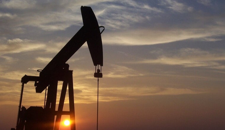
As reported by the Los Angeles Times, the map, released Friday by the Los Angeles County Department of Public Health, plots more than 6,000 active or idle oil wells and roughly 1,300 industrial facilities across the county. It also layers in underground gas-storage sites, fuel terminals, legacy pollution locations, recycling centers, dumps, and landfills. The launch comes on the heels of a multi-day chemical tank incident in neighboring Orange County that left many residents wondering what kind of industrial risks sit a few blocks from their own front doors.
Who built the map
The tool was built by the county’s Office of Environmental Justice and Climate Health, which pulled together multiple public datasets into one public-facing viewer. According to the Office of Environmental Justice and Climate Health, the map is meant to boost transparency about where industrial activity and waste sites sit in relation to neighborhoods and sensitive receptors, rather than leaving residents to guess from scattered permitting databases.
How the map works
The interactive viewer runs as an ArcGIS experience and organizes information into layers that users can toggle on and off. You can see different site types alongside nearby “sensitive receptors” such as schools, hospitals, and parks. The ArcGIS interface maps individual wells and facility points, and it also provides metadata on data sources and version dates for researchers, community groups, and planners who want to dig into the technical details instead of just the pins on the map.
Why it matters
Public mapping like this carries real weight in Southern California, a region with a long history of industrial incidents that can have both immediate and long-term health impacts, from refinery accidents to the 2015 Aliso Canyon gas blowout. Ongoing research into Aliso Canyon’s health effects is a reminder of why residents and advocates keep asking for clearer maps of industrial footprints. Better, more accessible data helps officials and communities prioritize monitoring, outreach, and policy responses. For background on the long-term health study tied to that disaster, see the UCLA Aliso Canyon study.
What can residents do?
If you want to check your own address, open the interactive map, enter a street address, then turn on the layers you are interested in and note distances to nearby wells and facilities. For people who need assistance, data extracts, or help with community outreach, the county’s Office of Environmental Justice and Climate Health can be reached through the Office of Environmental Justice and Climate Health website or by emailing [email protected]. The county also offers a downloadable map guide with layer descriptions and source information for anyone who wants to go a step beyond clicking around and really unpack what is on the screen.


