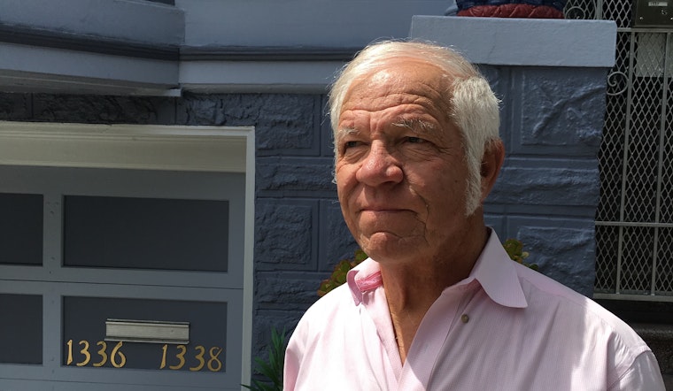
The man who introduces himself as "Dr. Color" answers the door of his Edwardian home sporting a pink-checked dress shirt, white muttonchops, and a twinkle in his eye.
Bob Buckter—it will become clear—is many things. But he is, foremost, an architectural colorist. It's a job he nearly invented himself. For 46 years he has been called in to concoct tasteful and appealing color schemes. "I do everything," he says. "Commercial, industrial, institutional. My specialty is historic homes."
Quick: imagine a colorful San Francisco Victorian. The way it looks in your mind's eye probably has something to do with Buckter's decades of steady influence.
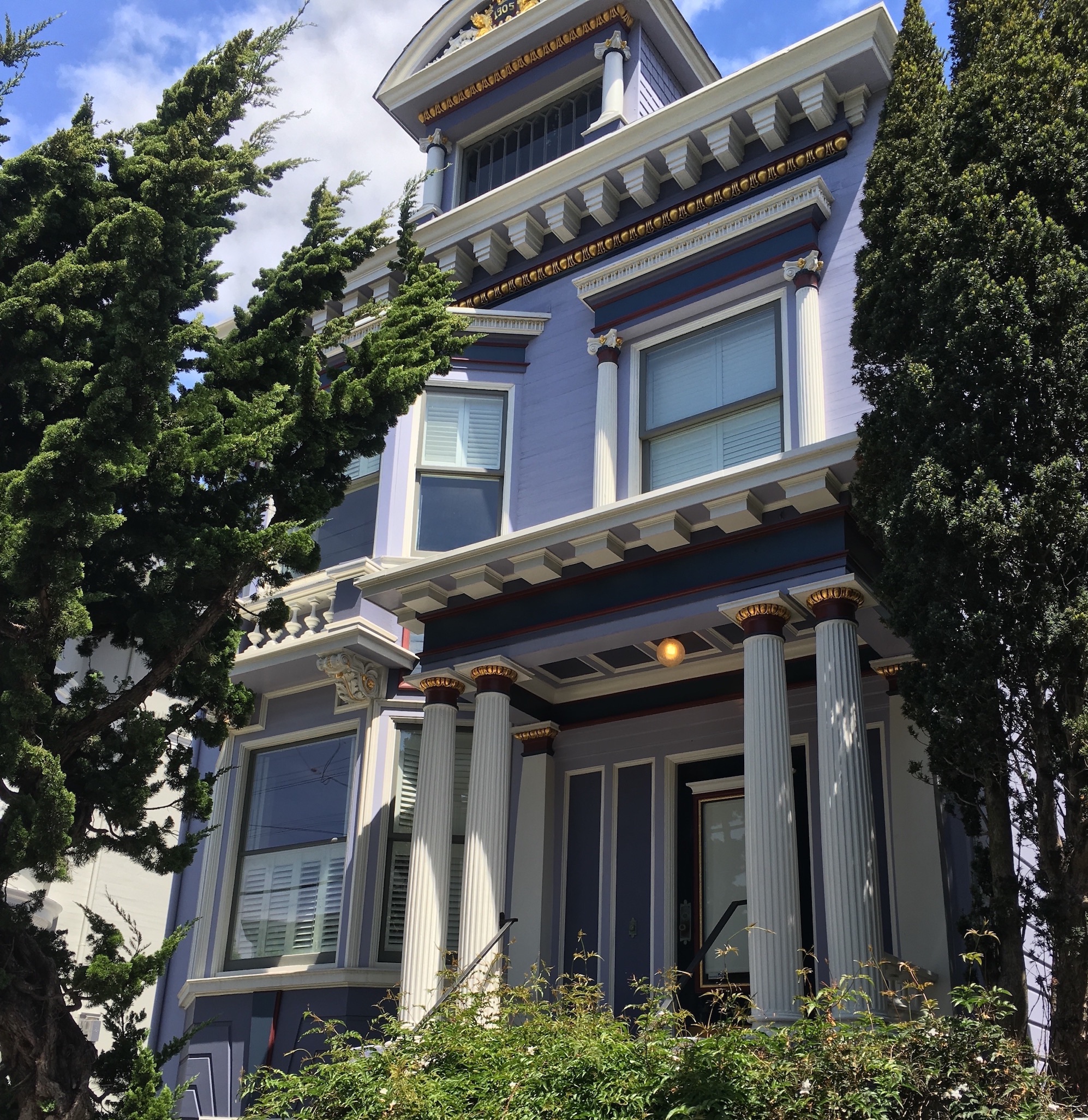 Cole Valley.
You may have seen his small blue signs "Bob Buckter, Color Consultant" affixed to colorful buildings around the city. But those represent a minuscule fraction of his output. He estimates he's done some 15,000 (!) exterior color jobs in San Francisco. If you add in the other buildings that have cribbed his schemes, it becomes clear that Buckter is more than just a San Francisco original: he's partly responsible for what people here and around the world think San Francisco looks like.
"That’s a heavy influence in this town. It’s the way this town looks, you know. I’m not on an ego trip, I’m just telling you facts." He pauses, then adds, "And I am on an ego trip," and laughs.
Contemporary Colors
Buckter is above all a pragmatic designer. His goals are to please his clients, the general public who will see the results, and himself, in that order.
Absent from this list are historians, who might quibble with his approach.
“These are far from any kinds of the colors used back then," he says, referring to one of his typical jobs. "A lot of these buildings were pretty plain. They were off-whites, or light beiges, and a black sash or a green sash and that’s it."
“I design contemporary colors to suit individual needs and preferences. That’s my motto. You want to copy what was there originally, go ahead and copy it. It's a free world. You want me to come in and do a design for you, I will."
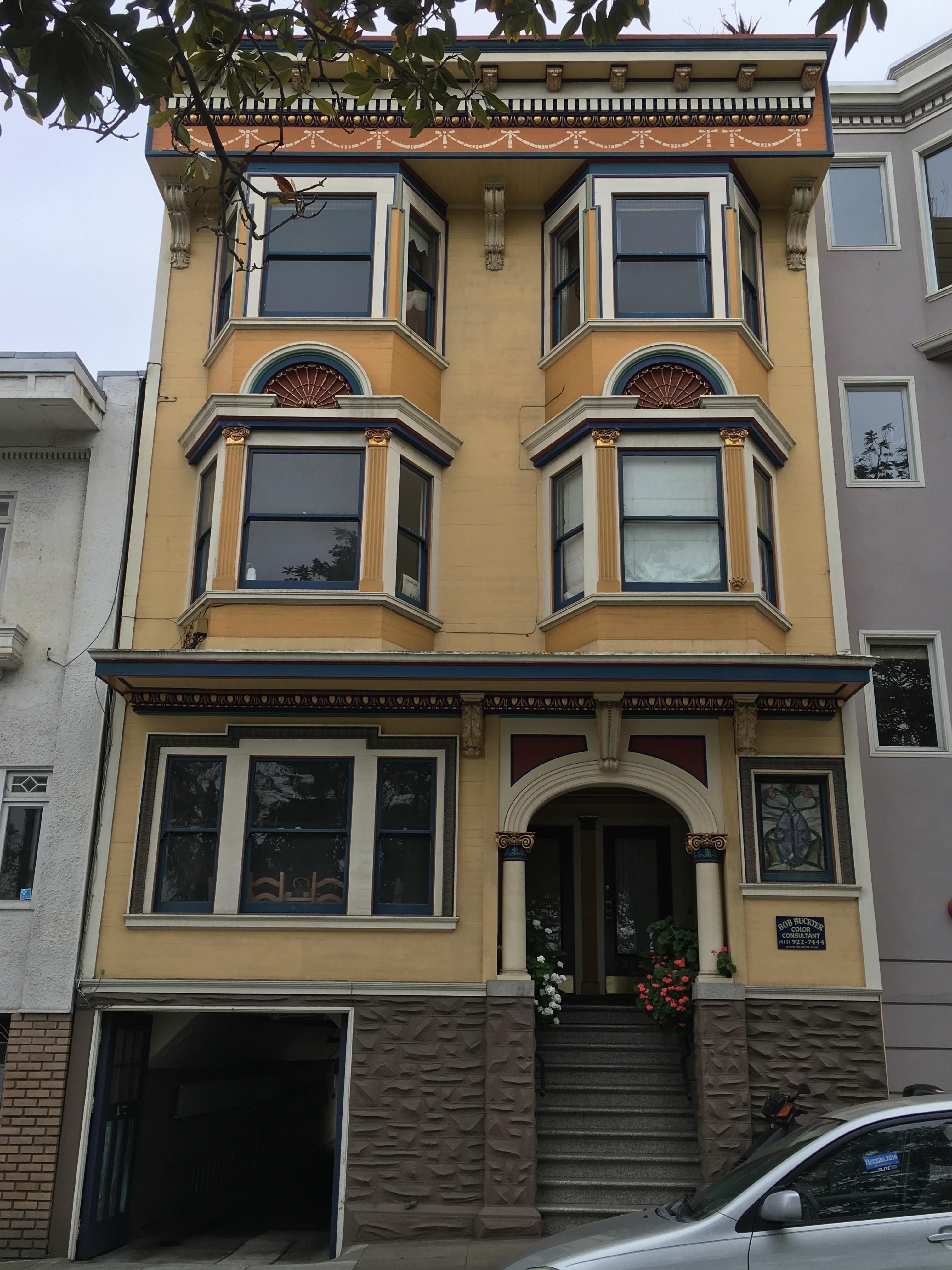 The Mission.
"Colors always go in trends. The Williamsburg colors that we used 200 years ago, I happen to like. The Victorian colors that were used 120 years ago, I usually don’t like." Ultimately, Buckter is a populist. "When most people see something and they like it, that’s how I define good taste. That’s my definition."
Anyone paying attention to the real estate market won't be surprised to hear what most people like right now: "Lot of grays. Gray is the big trend right now." Why? "I don’t know. All the techies are going for it."
A part of Buckter's business is consulting for high-end property investors. "One lady bought a building and added some bedrooms and she wanted all the right colors, so I went in there and did that, and she got half a million over asking. You know, curb appeal and what the market sees. First impressions are extremely important.… If they’re going to sell it, they want top dollar."
"You look like Dr. Color"
Bob Buckter is a native San Franciscan. He started out as a house painter in 1970, but quickly realized that he had an unusual knack for color design, so he began consulting on the side. “That was a difficult uphill task because, why should people pay two, three hundred dollars for somebody to pick colors? But I was able to convince people—some people—to do that." He thought, "I like this. I want to try to be the best at it, if I can. Or at least very good."
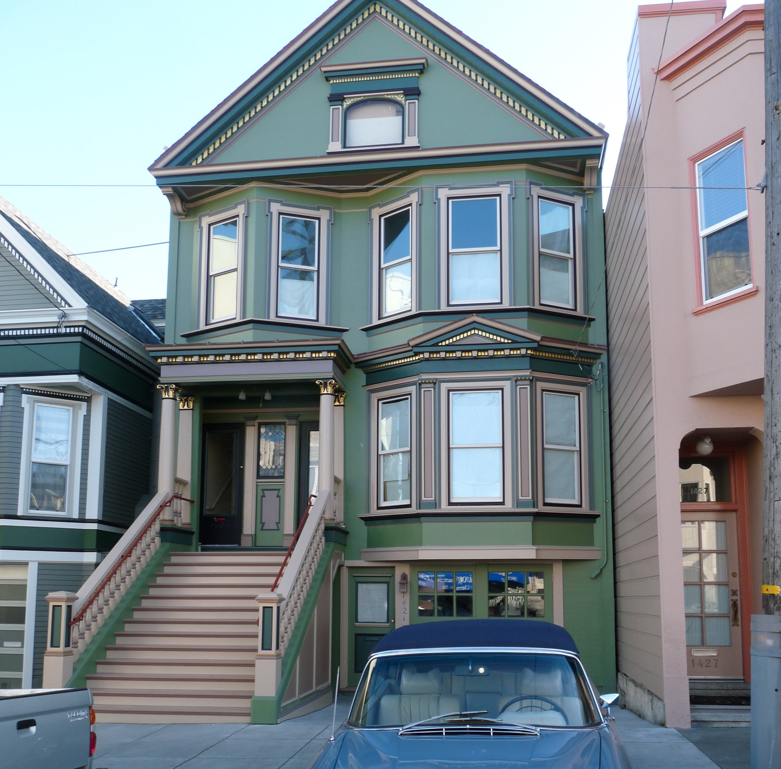 Central Richmond. (Photo courtesy Bob Buckter.)
Enough people were convinced, and within a few years, he was locally known for it. But this fledgling career was almost derailed by a different kind of success. Buckter's other side gigs in real estate were so lucrative that he was able to retire from all of it at age 30. He sailed around the world for a year, and when he came back, he decided he "would just do color consulting as a hobby." That was 1977. “My first year I did 40 jobs, then it turned into over 600 jobs a year. .. It got bigger."
It was in the early-to-mid 1980s that Buckter acquired his professional alias. A property manager in the East Bay with whom he frequently worked pointed at a small bag he brought to job sites. "He said, you look like Dr. Color with that bag, and it stuck."
His workload, consistent for decades, took a hit during the recession of 2008, and never quite recovered. "And then after things started to come back, a lot of other people got into the color business... Now everybody’s doing it." He says, "I was the man. I still am, to a fair degree."
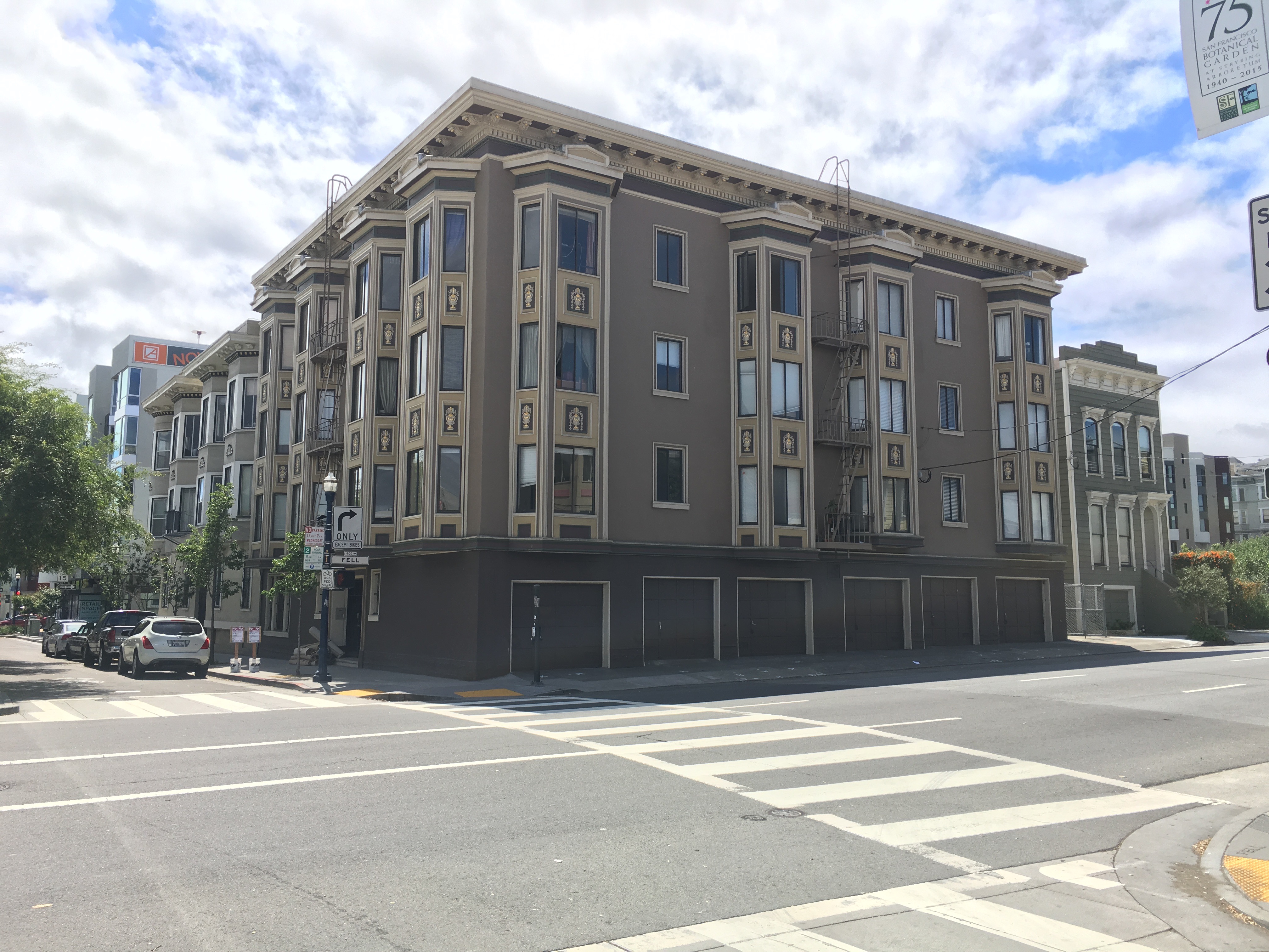 Hayes Valley.
His color business may be less frenetic these days, but he's no less busy for it; "Dr. Color" is only one of Bob Buckter's personas. “I have two other major life frames of reference," he says. "I have a chalet up in Squaw Valley. I go up there and spend 70 days a year and I know a lot of people up there and I love to ski. My nickname up there is Jack Powder. And then, I spend 70 days a year down in Costa Rica, because I am a conservationist of the rainforest. I bought up a huge chunk of land out in the country that I am preserving, enhancing, restoring, planting new trees, and defending against poachers. A thousand acres. I built a rustic rainforest lodge up near the top of the mountain overlooking the world. I go down there every other month. Down there, my nickname is." — here he pauses for effect — "Bob Del Cerro Nara. 'Cerro' means mountaintop. 'Nara' is the name of the mountain … That’s another huge part of my life." Buckter also restores and shows classic Mercedes-Benz convertibles, sneaking inauthentic color improvements past the judges.
He may not be a Victorian fetishist, but Buckter has a sense of—and love for—history. His own Edwardian home has been diligently remodeled since he bought it a few years ago, but with period-correct craftwork that Buckter himself has done: oak floors with inlaid walnut, and intricately painted ceiling medallions and wainscoting. He found a large piece of salvaged stained glass and punched open a new window sized just for it. His passion for the project is evident as he explains each detail.
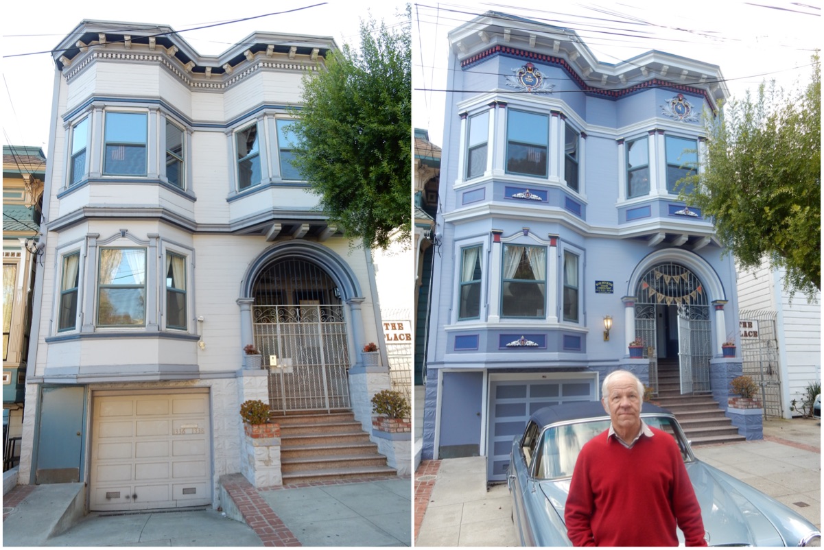 Buckter's home in the Mission, before and after. (Photos courtesy Bob Buckter.)
Buckter's office is in the front room of the home. He points out the tools of his trade: shelves and shelves of color swatches from all the major paint manufacturers. Then continues gesturing around the room. “I got a hold of these light fixtures, matching, over in Berkeley. I picked out the drapes. I’m a decorator besides a colorist. I can do that kind of stuff too. I can pick out fabrics and textures and all that stuff."
"This is a brand-new staircase. Look at these winders, I mean, that’s a piece of work. It’s perfect." Did he design it? "I worked with my carpenter on it." But he’s already walking away, eager to show off the next thing.
Paint-by-number
Buckter is meticulous but unfussy, perhaps reflecting a more practical kind of daily design. Making sure his clients are happy is the first order of business, and there are always multiple solutions that can work. His prices are reasonable—unchanged in 15 years and starting at around $400 for a simple project—and his turnaround is quick. How soon can he get started? "Immediate. Today and tomorrow. Or sooner. If it’s anywhere in the Mission I can come and walk over to [the] front door the next morning." He does jobs outside the Bay Area too, by mail.
He'll start by asking the client (or clients; he likes to have all the stakeholders in one place) what colors they like. If they aren't sure where to start, he'll pick up on clues: shades from their clothing or their furniture. Then he'll begin choosing paint samples.
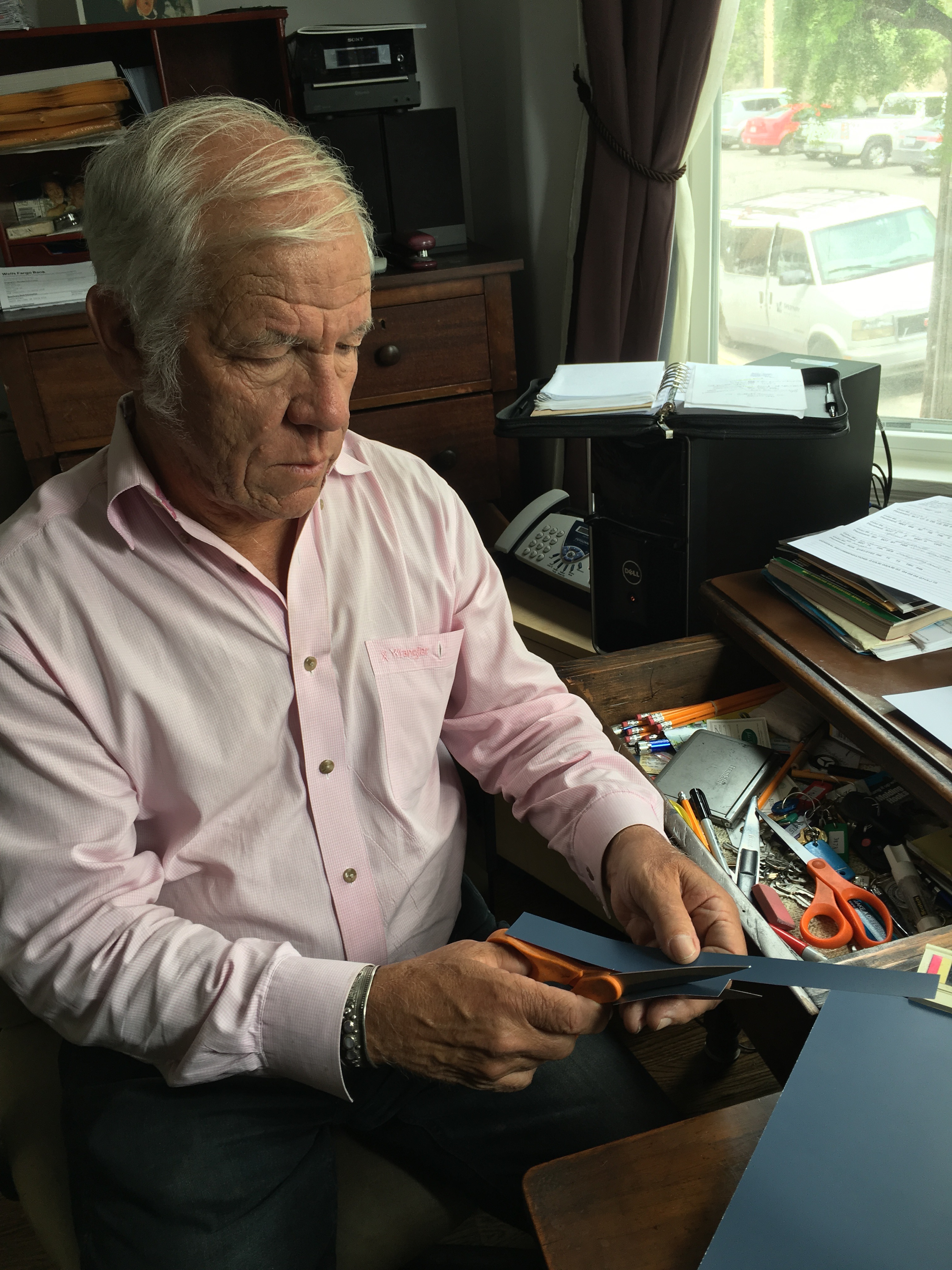 Dr. Color at work in his office.
"I pull out large 8”x10” color swatches. … I start out with the main body, then go into a major trim then into a minor trim, and an accent... Once I get a palette together that I believe the client is going to be happy with, then I specify it. Half of my work is design, the other half is directing the painters. I take photographs and do a paint-by-number scenario."
Although every job is different, Buckter has developed a consistent style that many of his historic projects adhere to: a medium value of low intensity for the main body. A light value for outlining the major trim and features of the building, "like an off-white, sometimes beige." Then a much deeper minor trim color, for sparing use on, for example, window sashes. Usually another accent or two.
"That white major trim only started forty-five, fifty years ago down here. I’m the one that basically made that very popular.… And there’s a practical reason for it too. That color shows up on some of the horizontal surfaces. Part of color design has to do with how much sun and solar exposure you get.… The lighter the color, the longer it lasts."
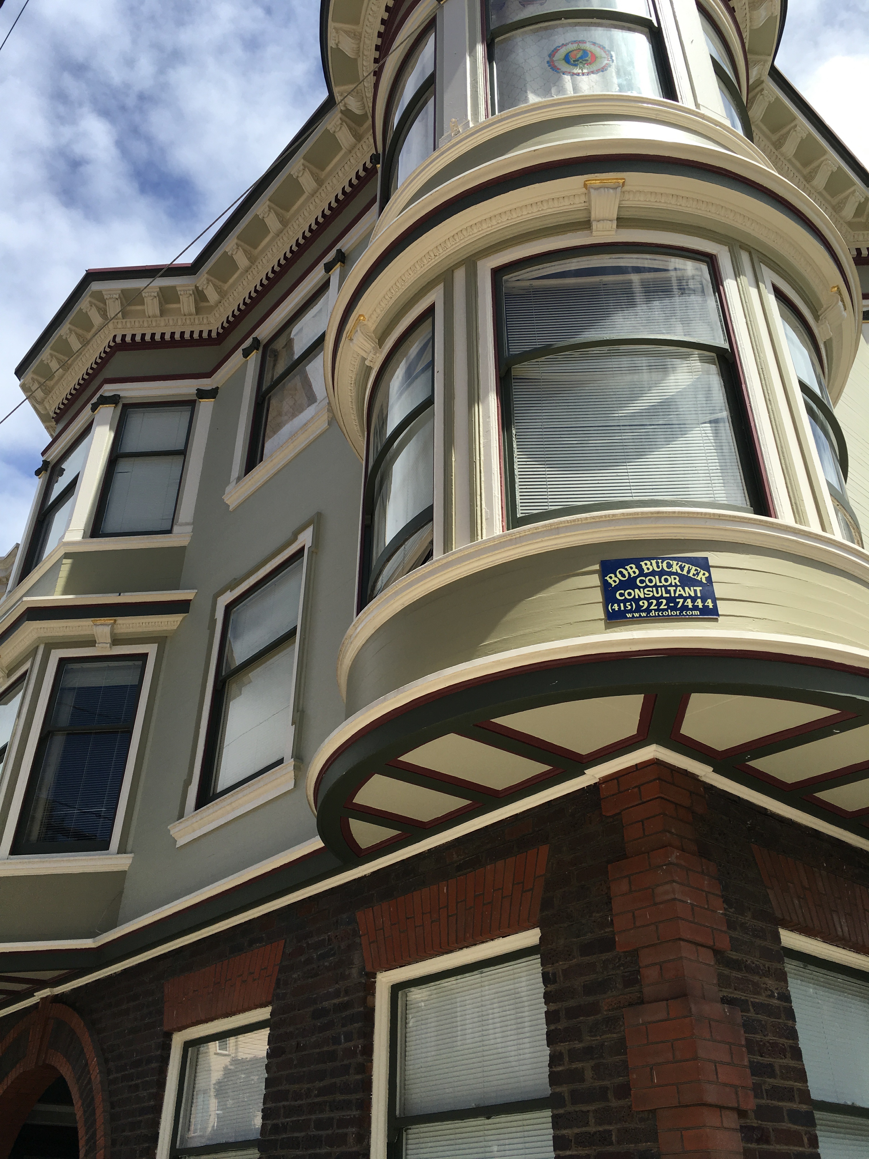 Cole Valley.
Another signature move is coloring the ground floor to a darker shade of the main body color, to make the base of the building feel more solid. “Architects use the illusion of something that is heavier, stronger, concrete block. ... I like to think I take it another step further. Darker bottom, stronger, heavier. Outline the major trim. Post and beam, not going to fall over on me!"
This particular patterning and subdivision of parts, now visible on so many buildings in San Francisco, may be Buckter's enduring legacy. Once you know what to look for, you'll see it everywhere.
Tickled Pink
Buckter flips through a promotional calendar from a painting firm he’s collaborated with. Many of the photos show his color jobs: Hayes Valley, Haight-Ashbury, the Mission. He stops at one on Castro St: "They were tickled to death, they loved it. And I’d already done the building previously." Different owners? "Probably. It’d been like 20 or 30 years. Some of these jobs are the third time around, which is great." He pauses. "A lot of people keep the colors though, so I don’t get called, because they’re happy with them and it still looks good."
One vista he hasn't directly touched is the famed "postcard row" of painted ladies on Alamo Square. He's done other historic work on the park, but not on that uniquely iconic stretch of Steiner St. They are "a bit understated for my taste," he says.
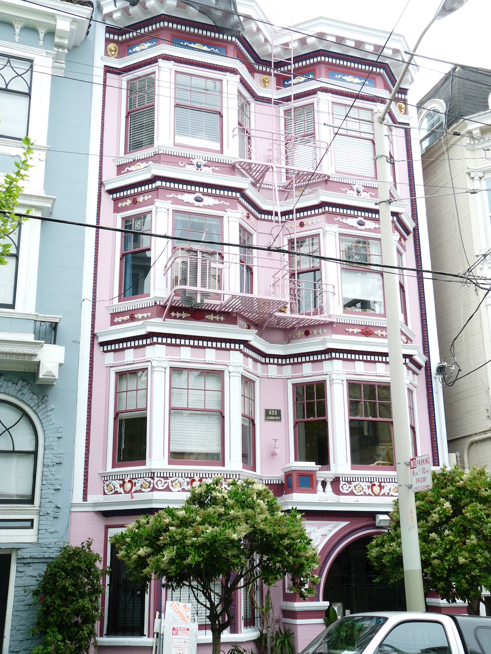
Understated is not Buckter's default mode. “I did a pink place on Ashbury. A study in pinks. Four or five years ago but it still looks good. I rarely get the opportunity but I can do it! And I know how to do it! And [the owner] said, 'Do it Dr. Color!' And I did! And she’s tickled pink, she loves it.” Buckter says pink schemes were popular in the late 1950s and early 1960s but they never came back. “It’s a polarizer, either you like it or you don’t."
What about his placards posted up around the city? Does he pay for the advertising, or give clients a discount in exchange for hanging them? No, he just asks. "I just say, you like it? Mind if I leave a sign up here? Most of the people say yes. Some people say absolutely not. Some people ask for it up front. … I just did a historic Queen Anne cottage in Napa, about two weeks ago. They’re going to make it into a bed-and-breakfast. It’s right alongside of another B&B that’s all done, looking great. My task is to try and knock that out of the water and put these people on the map. And they said, 'We’d really like to have your sign, too'." Many of the calling cards stay only temporarily, but others have lingered for decades, attesting to his long arc of influence and his clients' pride in the results.
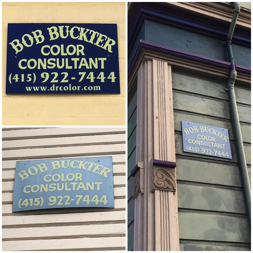 Dr. Color's ubiquitous placard.
Dr. Color is a busy man, and his signature historic work is only a fraction of the workload. "Like, Monday, I did three jobs: two hotel interiors, and a condominium homeowners’ association exterior, and I took a look at a shopping center. Big one." He goes on to describe what's on the docket for later. "Some people have a synagogue and they’re doing the interior colors on it, and they’re lost, and they’re stuck, and they want me to get over there as soon as I can and help them out. .. I’m called in on emergencies sometimes."
After nearly half a century in color design, Buckter is still excited by new challenges. He lights up describing a San Jose hotel project with "three big buildings. We’re going to divide it into three color schemes. And bright! Bright yellows, blue, periwinkle, violet... That’s going to be a fun project. They’re all brand new colors for me."
Bob Buckter turns 70 later this year, but he's "not really" looking at retirement.
"I’m good for a couple more years. This is me. How do I define myself in the world? I'm Dr. Color, you know? Take that away from me, and like, what am I?”
What about Jack Powder, and Bob Del Cerro Nara?
"Oh yeah, oh yeah,” he says and chuckles.
Bob Buckter, Color Consultant, is available for a range of color design, architectural enhancement, and restoration projects. His website is drcolor.com, and he can be reached by email at [email protected], or by phone at (415) 922-7444.
