In a move to arm Maricopa County residents against the ravages of scorching temperatures, the county's Department of Public Health rolled out a cutting-edge. Clickable heatmap this week—meant to lay bare the stark reality of how heatwaves hammer human health, according to a county statement.
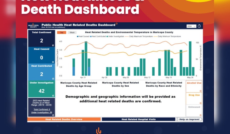
The new online dashboard, which replaced the weekly reports previously pushed out on the health department's site—and will be spruced up with the latest data every Tuesday—boasts near real-time stats on hospital trips triggered by the heat, and the toll it's taken in deaths, the number of which are 42 at present, under the magnifying glass of the Medical Examiner (OME). "This is a significant new step in tracking the effects of heat on people who live in or visit Maricopa County, which we have been doing since 2006," Dr. Rebecca Sunenshine, medical director for MCDPH, spelled out.
The interactive tool is part of a wider, communal crusade buckling down on heat health hazards, ahead of what's feared to be another sweltering summer of potentially lethal temperatures. “Death investigations can take several months to finalize, so it’s important to monitor how many suspect deaths are being investigated," Dr. Sunenshine told the public, emphasizing the immediacy of the information now available.
Not just a mere tally, the Power BI-powered panel offers comparisons between this year's and last's grim figures and details—who's succumbed or suffered by age, race, and sex—stuff that's crucial to pinpoint those in the crosshairs of the climate menace and shield them. The dashboard also spotlights daily temperature highs and lows, a nod to the critical cooldown nights offer the body unless they're unusually hot—which means the heat hazard kicks in earlier and lingers. Pieced together with tech support from the county's Enterprise Technology team, it’s all designed to light the way for officials and agencies knee-deep in the fight against thermal threats.
For those keen to dive deep into the details, the dashboard, which is best viewed on desktop, slices and dices the data on heat-related emergency room and hospital admissions sourced from BioSense—a syndromic surveillance program held by the CDC—while death data hops off certified death certificates. What's more, it's set to unfurl an even finer look at fatalities, with an interactive map homing in on where they happened within sub-county lines, and the conditions, including whether the victims had cool air at their beck and call or were left to swelter.