California just tightened the map that helps decide which neighborhoods are officially considered "disadvantaged" and first in line for climate and pollution-fighting dollars.
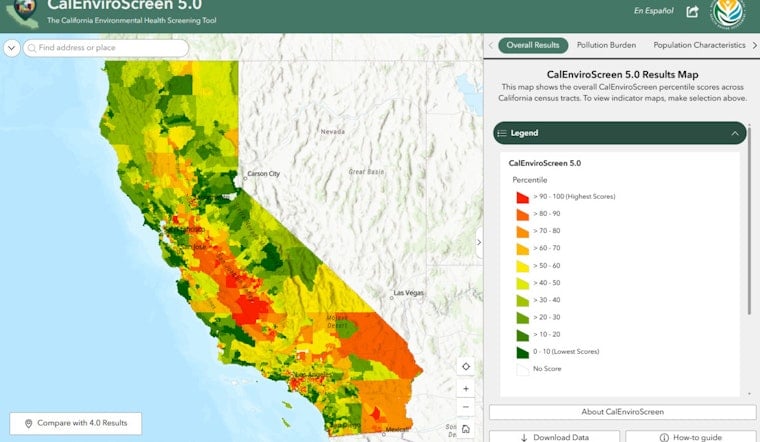
On July 1, 2026, the state released CalEnviroScreen 5.0, the fifth major update to its pollution and community vulnerability mapping tool. The new version adds two indicators, a Small Air Toxic Sites metric and a Diabetes Prevalence measure, that can change which census tracts land on the disadvantaged list. Those labels are not symbolic: they help determine eligibility for a big slice of California Climate Investments, so shifts on the map can mean shifts in where public money goes.
What's new in 5.0
The Office of Environmental Health Hazard Assessment says CalEnviroScreen 5.0 reflects updated datasets, refined methodology and a process shaped with extensive community co-design, and it released the tool and supporting documents on July 1. According to OEHHA, the update adds indicators for Small Air Toxic Sites and Diabetes Prevalence and expands data on PFAS in drinking water and children's blood lead levels. "We are ensuring that vital state resources and targeted policy benefits reach the neighborhoods that need them most," CalEPA Secretary Yana Garcia said in the release.
Money on the line
CalEnviroScreen is not just a science project, it is effectively a routing system for state climate and pollution-reduction money. Under state law, at least 35% of California Climate Investments program benefits must go to priority populations, including disadvantaged communities identified by CalEnviroScreen. As of late 2024, roughly $9.2 billion in implemented California Climate Investments projects had benefited those priority populations, according to California Climate Investments.
How the new indicators work
The new Small Air Toxic Sites indicator is meant to catch a category of pollution sources that can slip through the cracks. It flags oil and gas wells and smaller facilities, such as gas stations, that report releases of air toxics but were not already captured by existing toxic release measures. The Diabetes Prevalence indicator, meanwhile, uses population health data to reflect how vulnerable residents may be to pollution exposure.
Those tweaks come along with other technical adjustments, including expanded buffer zones around hazardous-waste sites and added PFAS data for drinking water. The full list of methodology changes is detailed in OEHHA's technical report.
The debate over accuracy
Because the map steers money, its design has been under a microscope. A 2024 audit found that CalEnviroScreen is highly sensitive to relatively small specification changes and recommended safeguards such as a second model and external oversight. That analysis, published in Nature Machine Intelligence, highlighted how technical choices inside the model can have outsize consequences.
Reporting by CalMatters has underscored what is at stake, noting that these modeling debates translate into billions of dollars in funding differences for neighborhoods across California.
What's next
CalEPA has already published a preliminary 2026 Disadvantaged Communities designation based on the updated tool and is collecting public feedback through workshops and written comments. As CalEPA notes, written comments on the Preliminary DAC Designation are due by 5:00 p.m. on August 14, 2026.
Environmental and community groups are expected to scrutinize the new map closely during the public review period, pushing to ensure that conditions described by residents line up with how their neighborhoods are scored. Local outlets are already zeroing in on the tract-level shifts; FOX40 aired a segment this week as communities started digging into how the updated designations could affect them.